Justin is a versatile Experience Designer with over 6 years of experience, specializing in thoughtful design that seamlessly blends delight and usability. His journey began with a fascination for web design and typography, leading him to specialize in Design Communication at LASALLE, accredited by Goldsmiths, University of London.
Currently serving as a Senior Experience Designer at Dyson, Justin has also served the last seven years as an independent creative. He has enjoyed collaborating with a wide array of clients, spanning from boutique brands such as T.B.C., T:>Works and Mathathon, to tech industry leaders like IBM’s iX and Google's Startup Jam. He’s also worked with educational and governmental bodies like Singapore University of Technology and Design (SUTD) and Singapore Institute of Technology (SIT), among others.
Currently serving as a Senior Experience Designer at Dyson, Justin has also served the last seven years as an independent creative. He has enjoyed collaborating with a wide array of clients, spanning from boutique brands such as T.B.C., T:>Works and Mathathon, to tech industry leaders like IBM’s iX and Google's Startup Jam. He’s also worked with educational and governmental bodies like Singapore University of Technology and Design (SUTD) and Singapore Institute of Technology (SIT), among others.
EDUCATION
2021 (Jun - Oct)
CuriousCore
4-Month UX Career Accelerator
(Part-Time)
2021 (Apr)
CuriousCore
UX Design Course
(2-day Intensive)
2016 – 2020
LASALLE College of the Arts
BA(Hons) Design Communications
First-Class Honours
2010 – 2012
Nanyang Junior College
Art Elective Programme (AEP)
PROFESSIONAL DEVELOPMENT
• Co-TYPE Workshop (2022)
• Crafting Type Singapore (2019)
• External Assessment Summer School (2018)
FEATURES
2024
form–flux–futures, Alumni Panel
LASALLE College of the Arts
School of Design Communication
2024
Open Gov Products (OGP)’s
Build For Good Accelerator (Funded) Team
UX Lead
2024
Open Gov Products (OGP)’s
Build For Good Hackathon
UX Lead
2023
Singapore Institute of Technology
Design Innovation Workbook
Design Lead
2022
‘Veneer and Visage’ Exhibition
Creative and Editorial Lead
Supported by NAC & Supperhouse
2022
Further Reading Issue No. 3
Down South, Outgazing Our Views
Sensorial Design in the Contemporary Era
2024
form–flux–futures, Alumni Panel
LASALLE College of the Arts
School of Design Communication
2024
Open Gov Products (OGP)’s
Build For Good Accelerator (Funded) Team
UX Lead
2024
Open Gov Products (OGP)’s
Build For Good Hackathon
UX Lead
2023
Singapore Institute of Technology
Design Innovation Workbook
Design Lead
2022
‘Veneer and Visage’ Exhibition
Creative and Editorial Lead
Supported by NAC & Supperhouse
2022
Further Reading Issue No. 3
Down South, Outgazing Our Views
Sensorial Design in the Contemporary Era
2021
Textures 2021:
The Bottled City by
The Arts House
A Crab is a Crab and not a Scrap
2021
ASEAN SOGIE Caucus
thenational.api
Creative and Web Design Lead
2020
The LASALLE Show 2020
Highlighted in Project Features
Anthropocenic Futures in Singapore
2019
The Rejects Show
Hosted by The Substation
2017
The World of Innocence IAIF –
Visual Art Competition
(Photography Series)
2016
LASALLE Open House 2016 –
1 Gestalt Explorations – A Zine
2 Spiral – A Paper Sculpture
2016
Outstanding Award –
SLA Photography Competition


(UX Design, UX Research)
Chömp
(Design Statement)
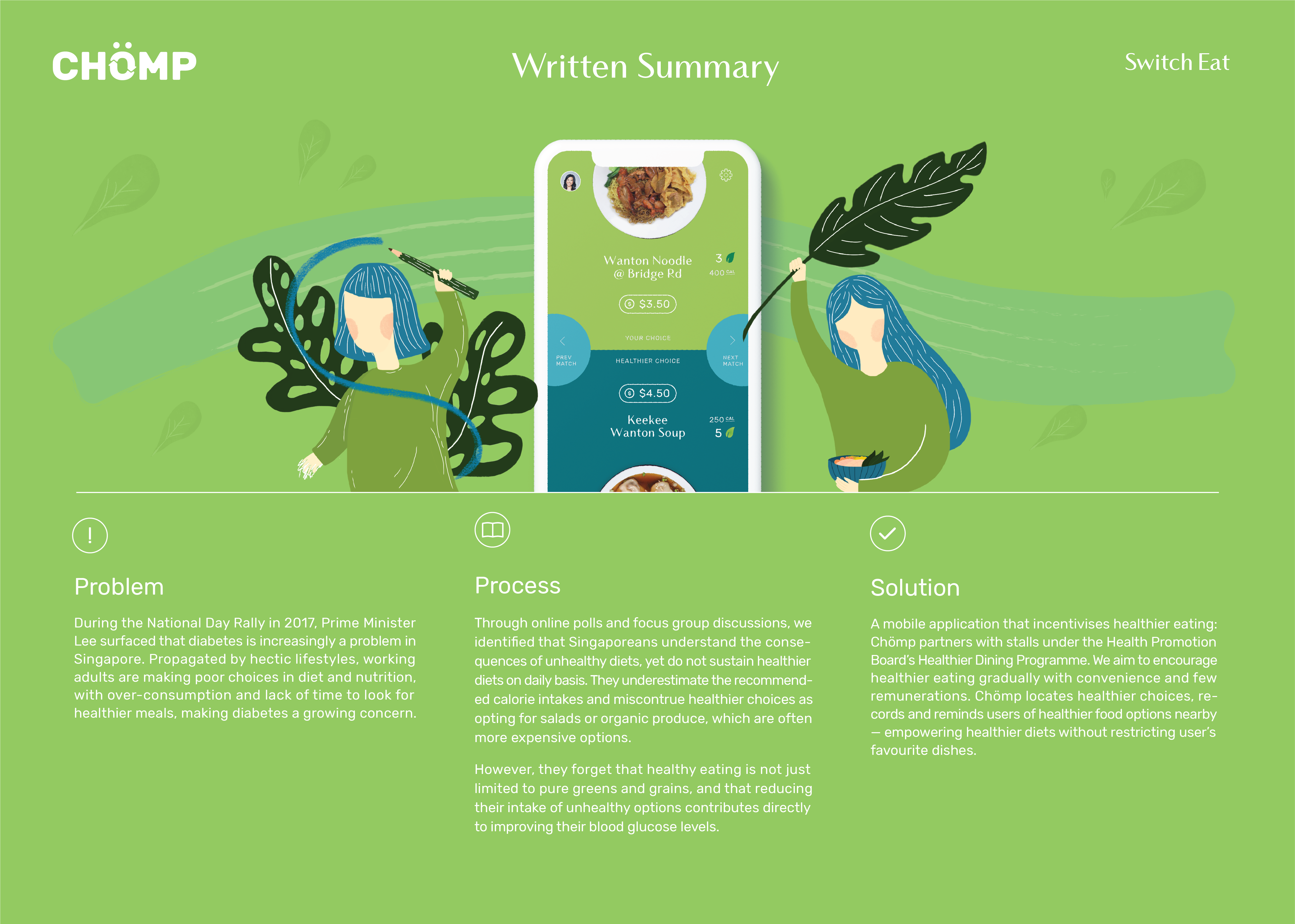
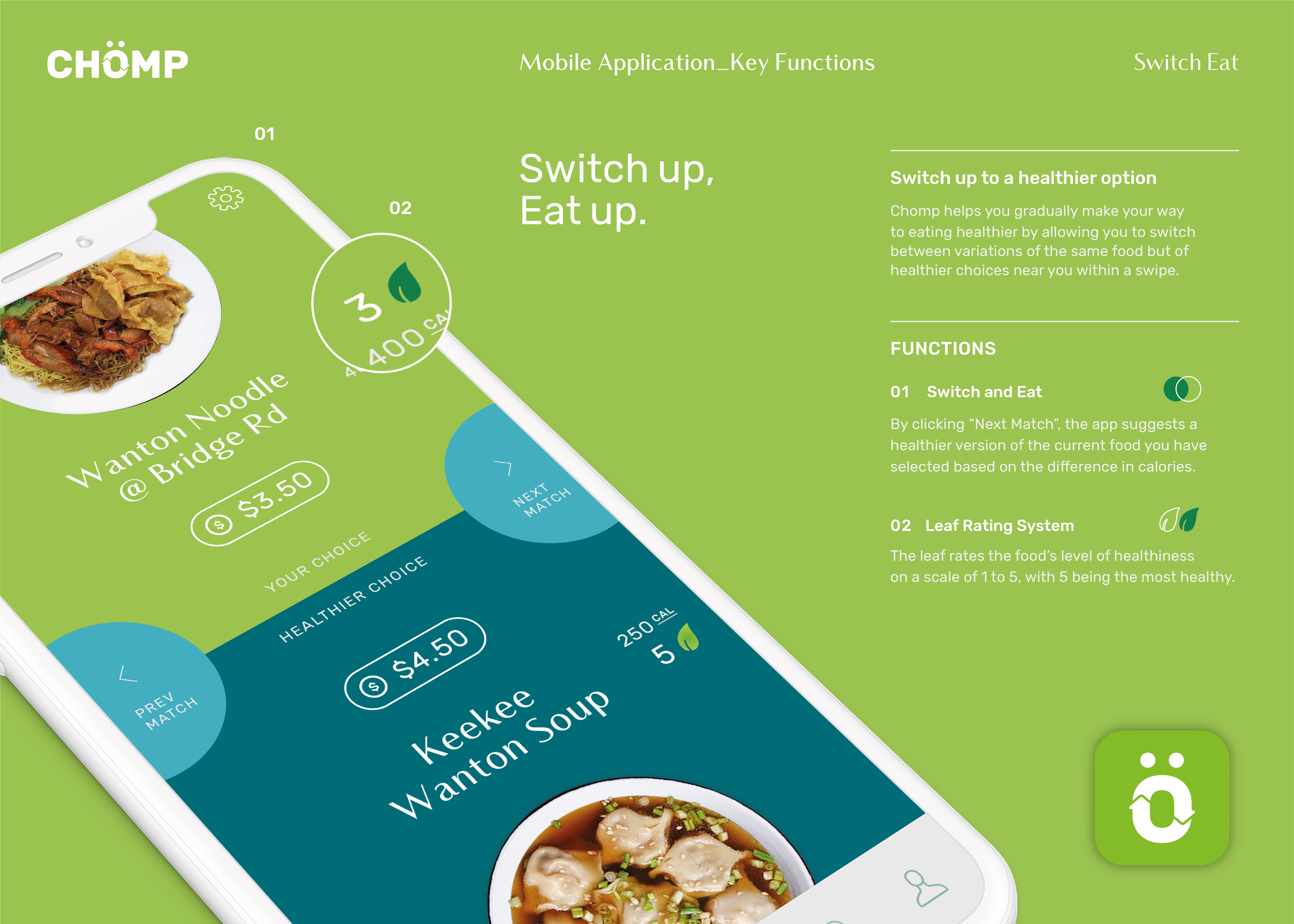
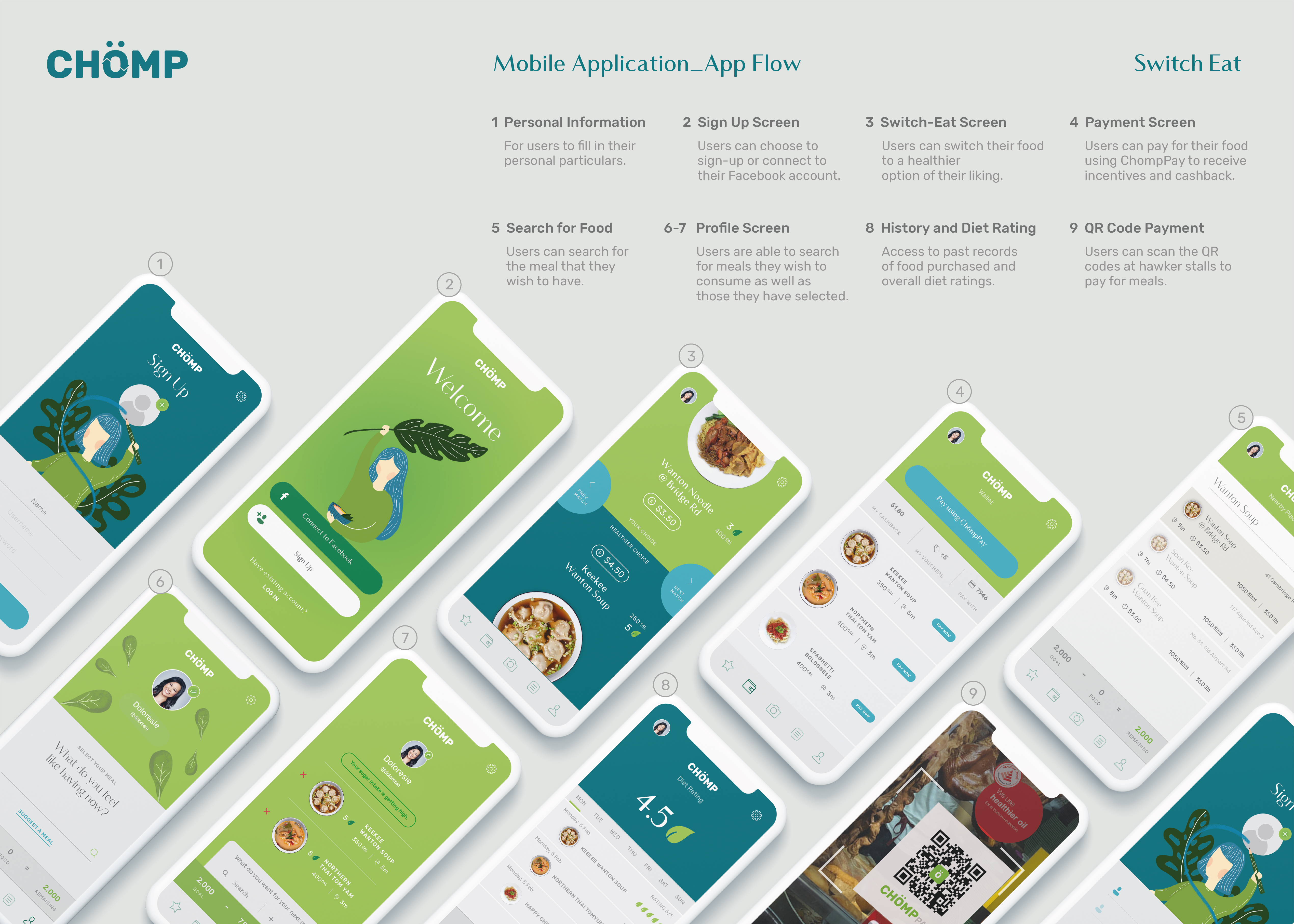
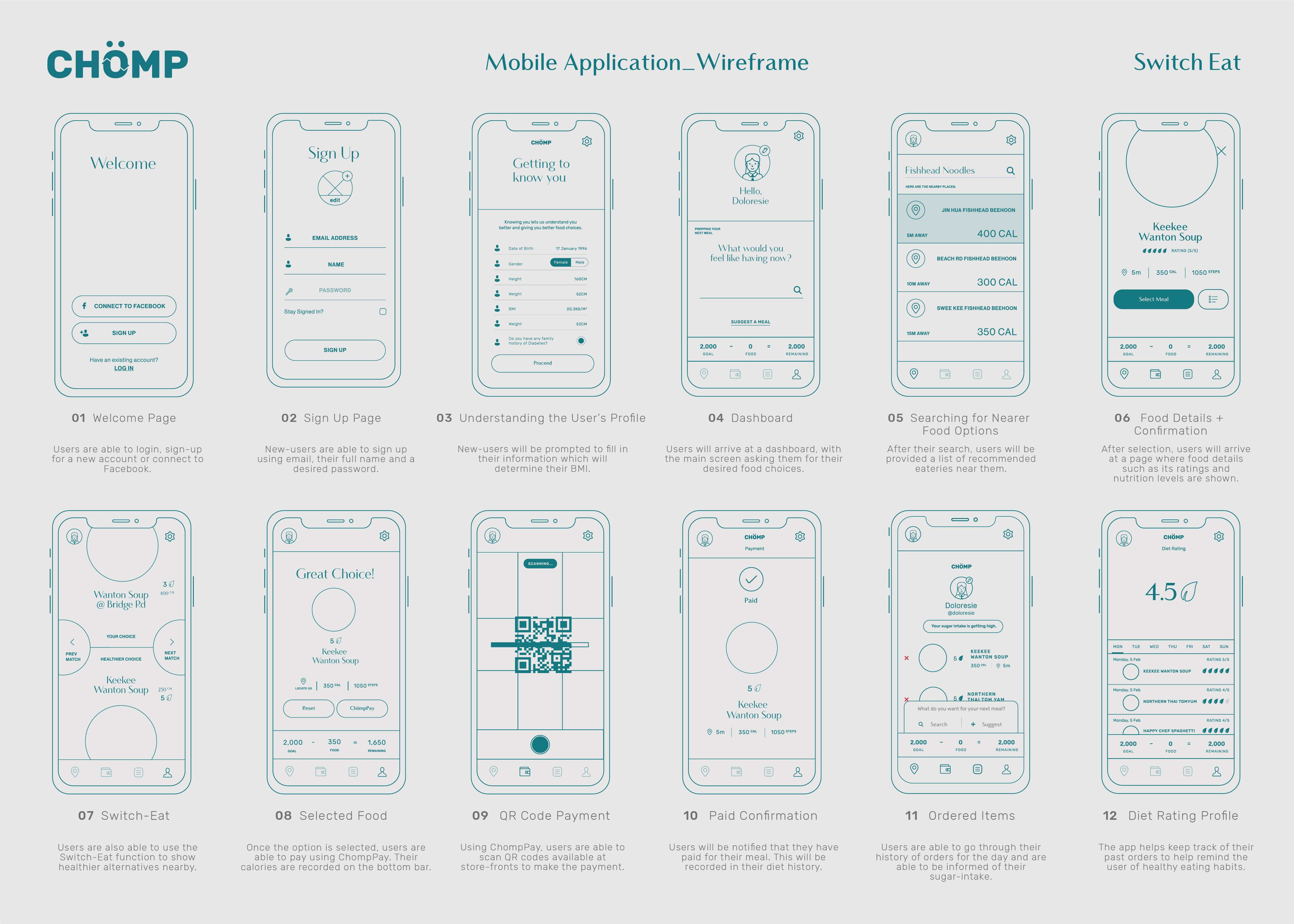
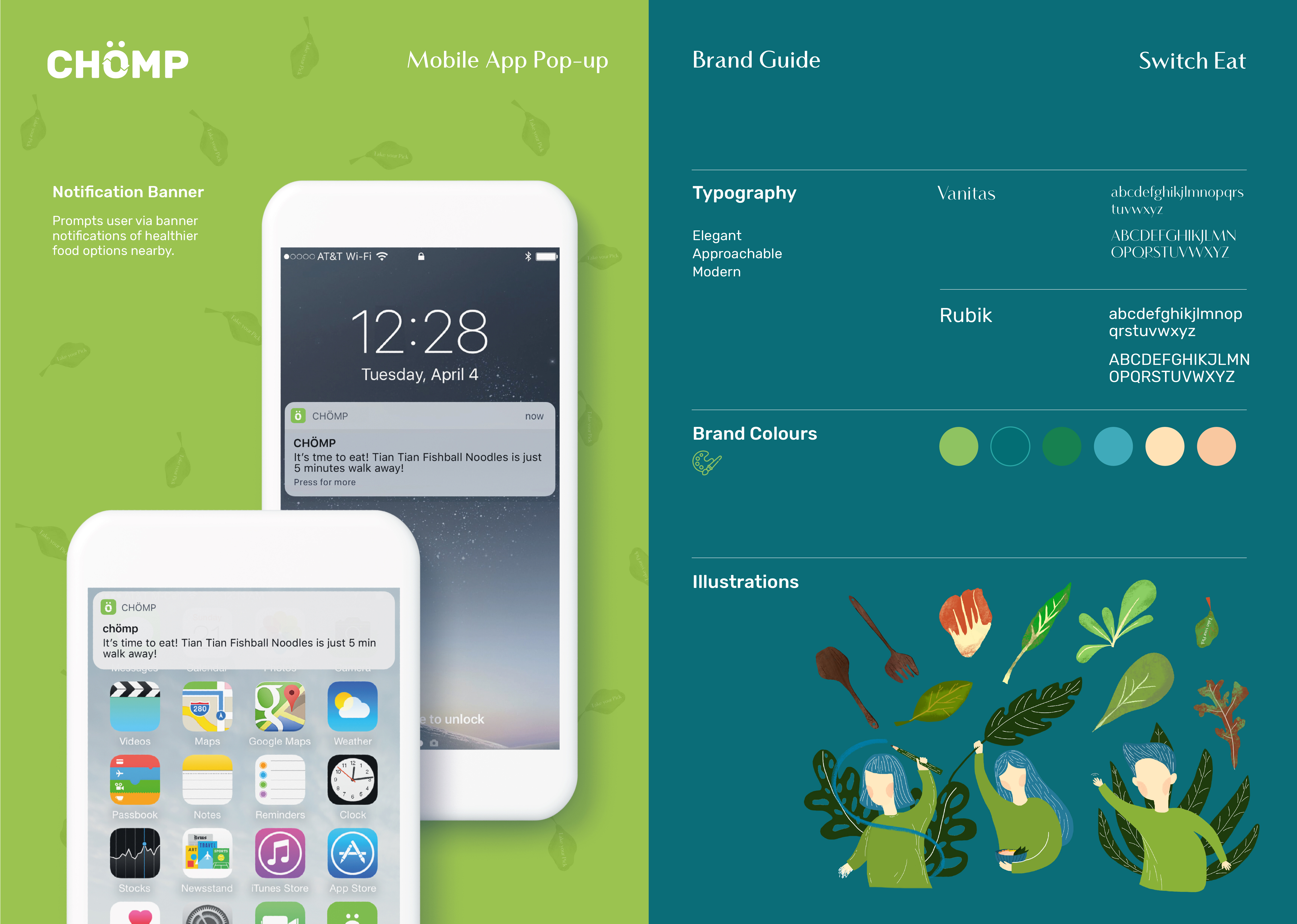
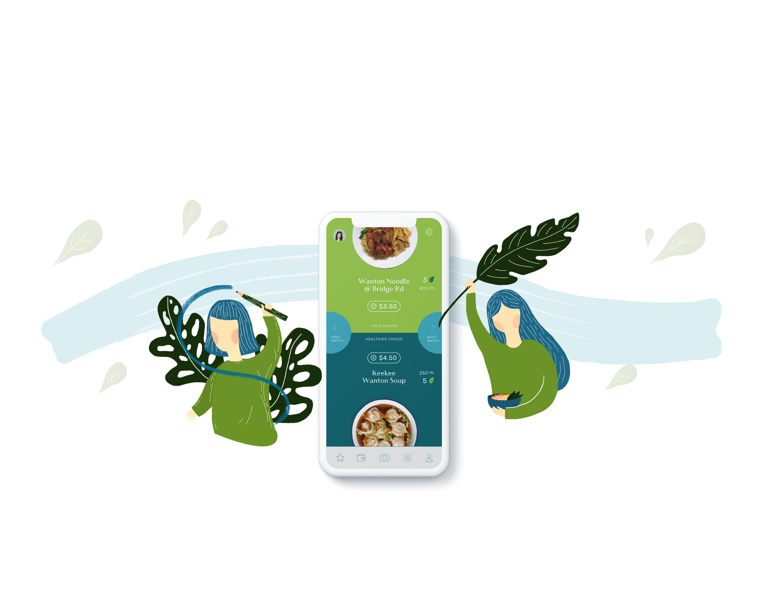
Chömp helps you gradually make your way to eating healthier by allowing you to switch between variations of the same food but healthier choices near you.
(Problem)
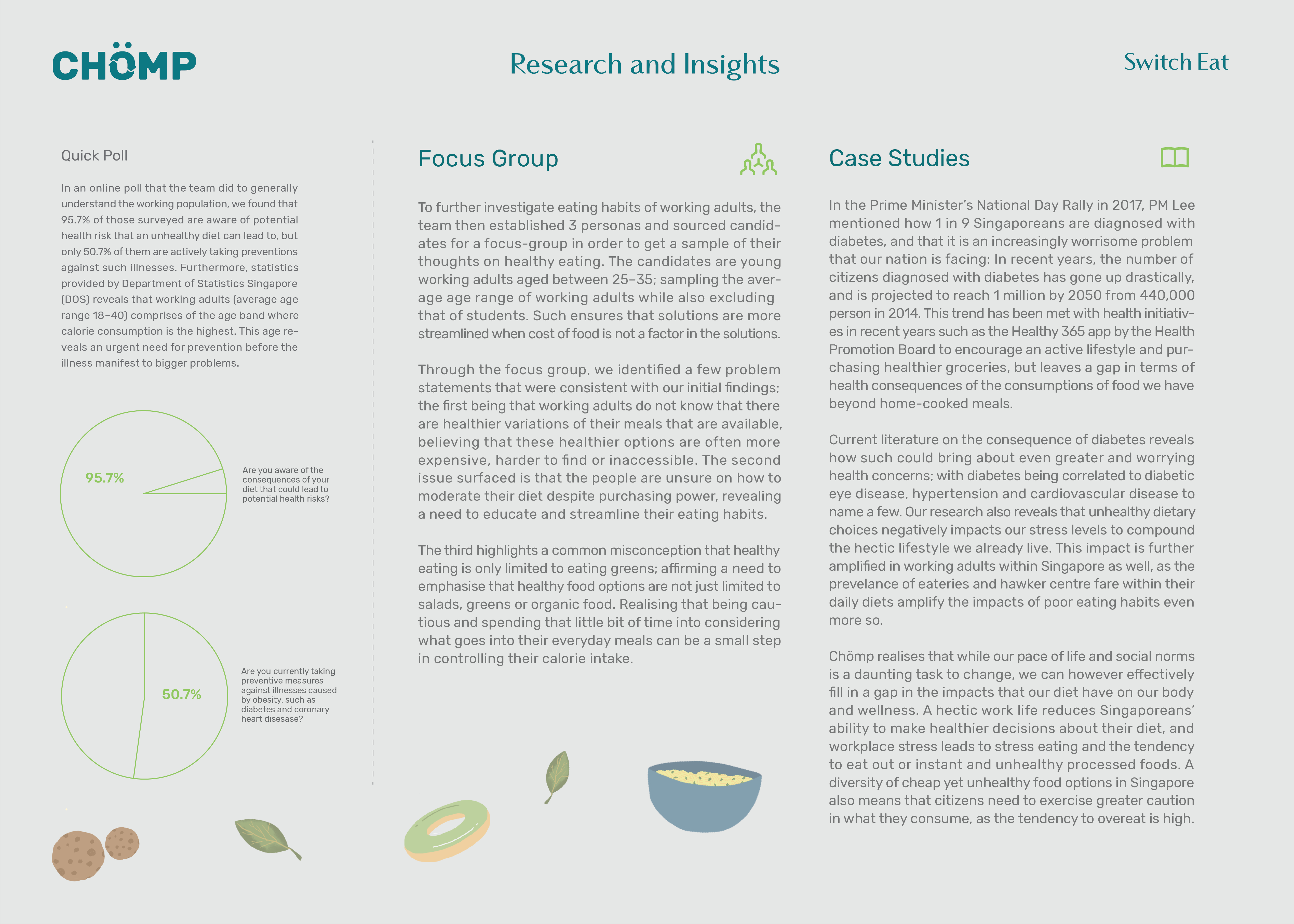
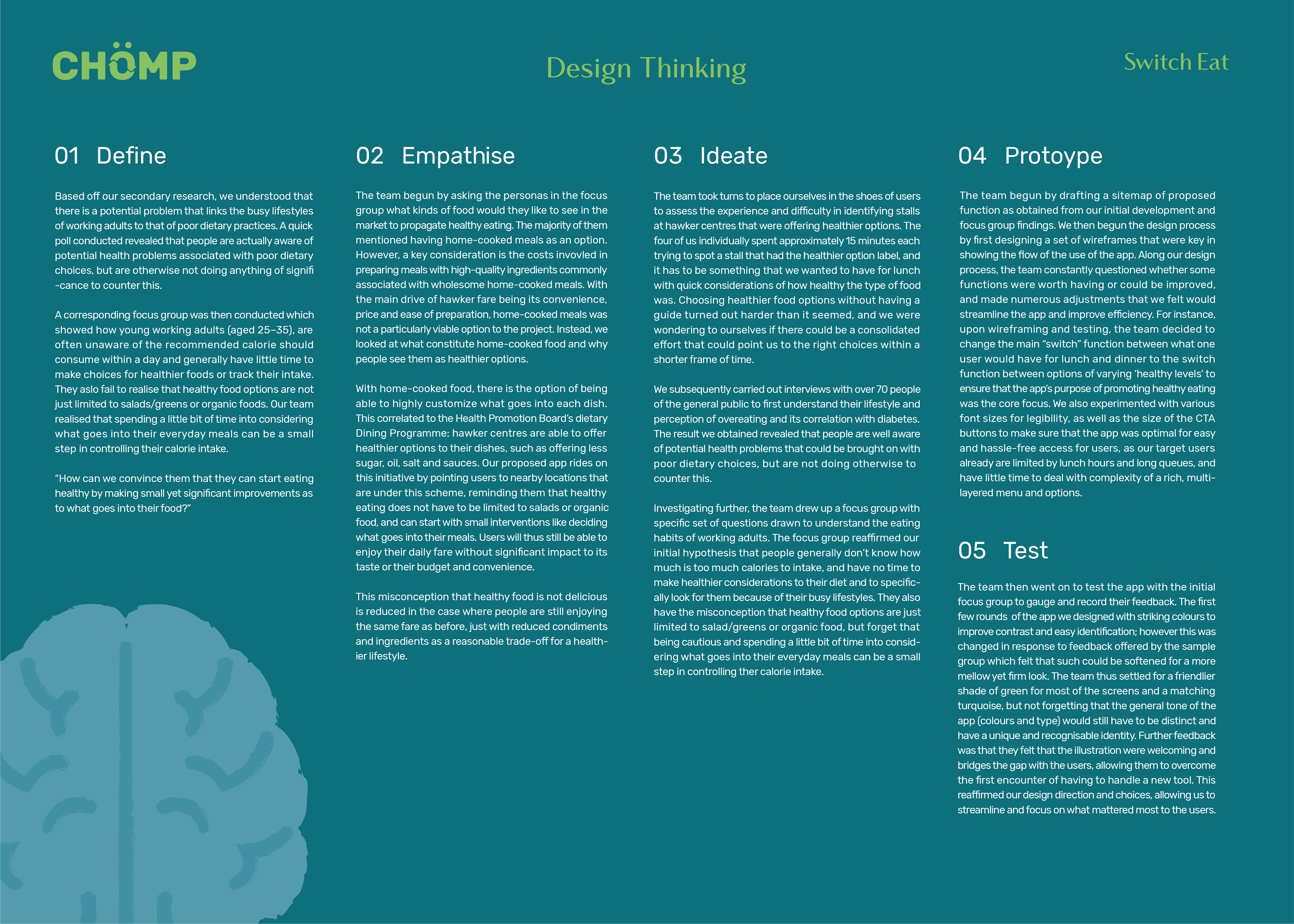
During the National Day Rally in 2017, Prime Minister Lee surfaced that diabetes is increasingly a problem in Singapore. Propagated by hectic lifestyles, working adults are making poor choices in diet and nutrition, with over-consumption and lack of time to look for healthier meals, making diabetes a growing concern.
(Process)
Through online polls and focus group discussions, we identified that Singaporeans understand the consequences of unhealthy diets, yet do not sustain healthier diets on daily basis. They underestimate the recommended calorie intakes and miscontrue healthier choices as opting for salads or organic produce, which are often more expensive options. However, they forget that healthy eating is not just limited to pure greens and grains, and that reducing their intake of unhealthy options contributes directly to improving their blood glucose levels.
(Solution)
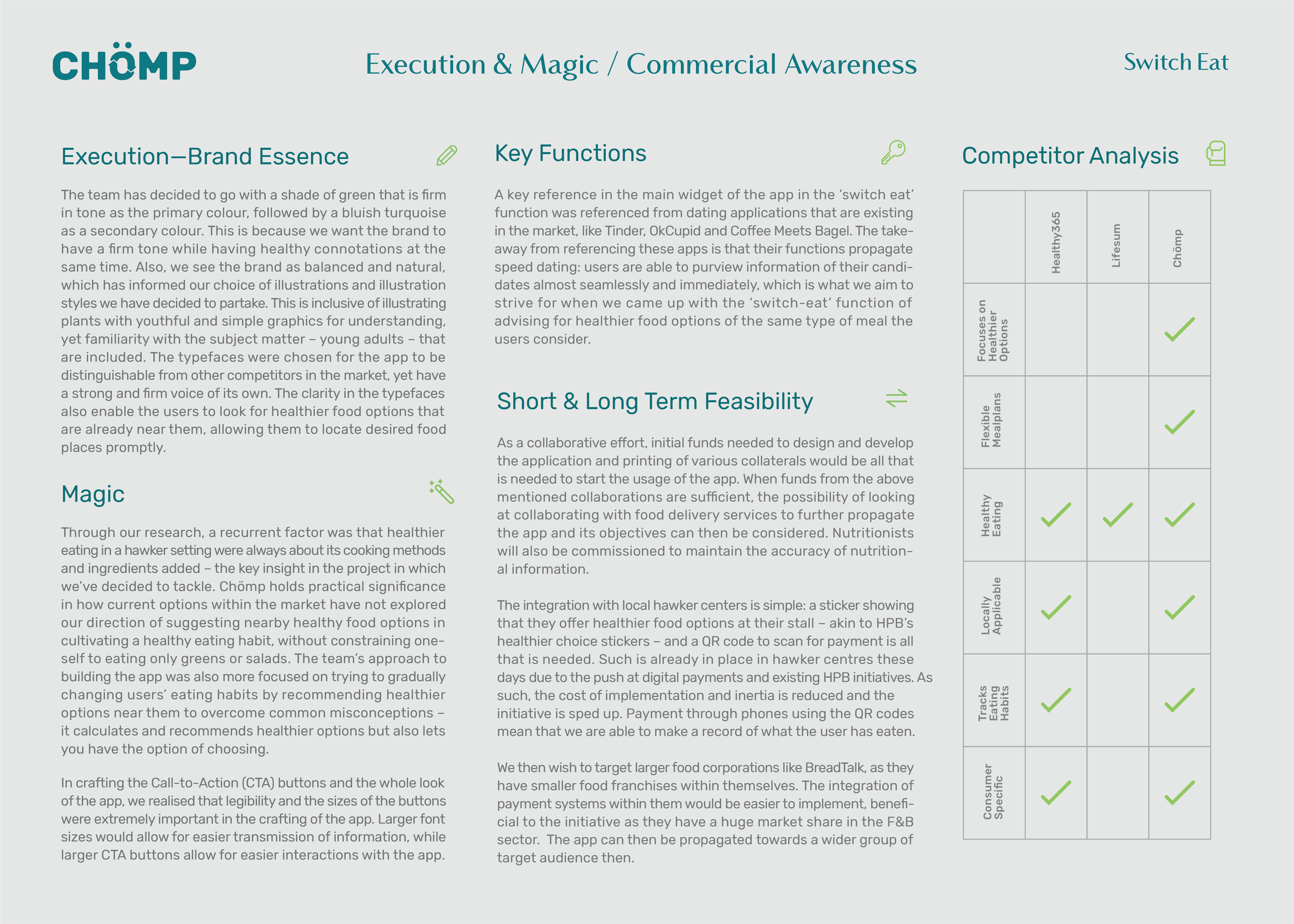
A mobile application that incentivises healthier eating: Chömp partners with stalls under the Health Promotion Board’s Healthier Dining Programme. We aim to encourage healthier eating gradually with convenience and few remunerations. Chömp locates healthier choices, records and reminds users of healthier food options nearby — empowering healthier diets without restricting user’s favourite dishes.
Team credits to Catherine Kusuma, Jocelyn Lim, and Natasya Budi Utomo.
Chömp helps you gradually make your way to eating healthier by allowing you to switch between variations of the same food but healthier choices near you.
(Problem)
During the National Day Rally in 2017, Prime Minister Lee surfaced that diabetes is increasingly a problem in Singapore. Propagated by hectic lifestyles, working adults are making poor choices in diet and nutrition, with over-consumption and lack of time to look for healthier meals, making diabetes a growing concern.
(Process)
Through online polls and focus group discussions, we identified that Singaporeans understand the consequences of unhealthy diets, yet do not sustain healthier diets on daily basis. They underestimate the recommended calorie intakes and miscontrue healthier choices as opting for salads or organic produce, which are often more expensive options. However, they forget that healthy eating is not just limited to pure greens and grains, and that reducing their intake of unhealthy options contributes directly to improving their blood glucose levels.
(Solution)
A mobile application that incentivises healthier eating: Chömp partners with stalls under the Health Promotion Board’s Healthier Dining Programme. We aim to encourage healthier eating gradually with convenience and few remunerations. Chömp locates healthier choices, records and reminds users of healthier food options nearby — empowering healthier diets without restricting user’s favourite dishes.
Team credits to Catherine Kusuma, Jocelyn Lim, and Natasya Budi Utomo.

(UX Design, UX Research)
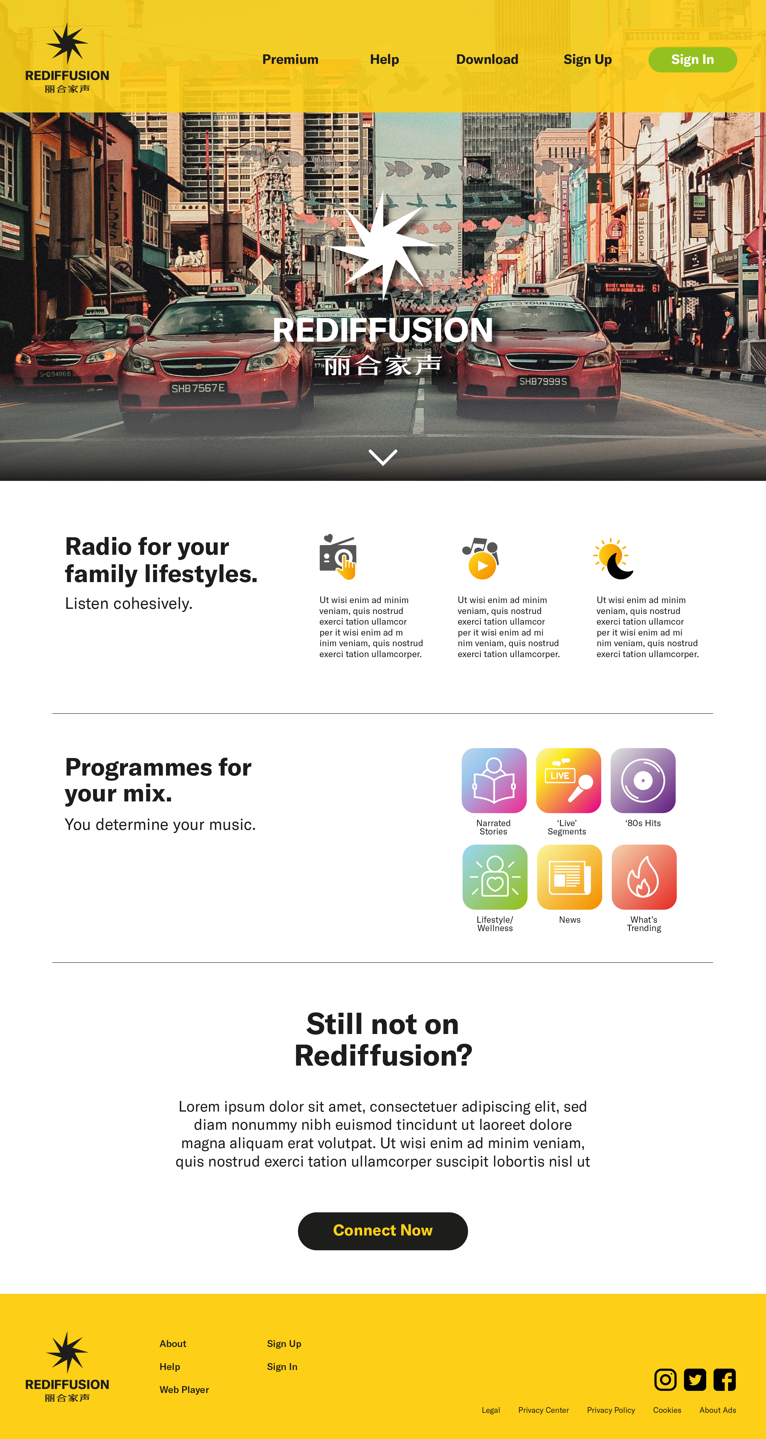
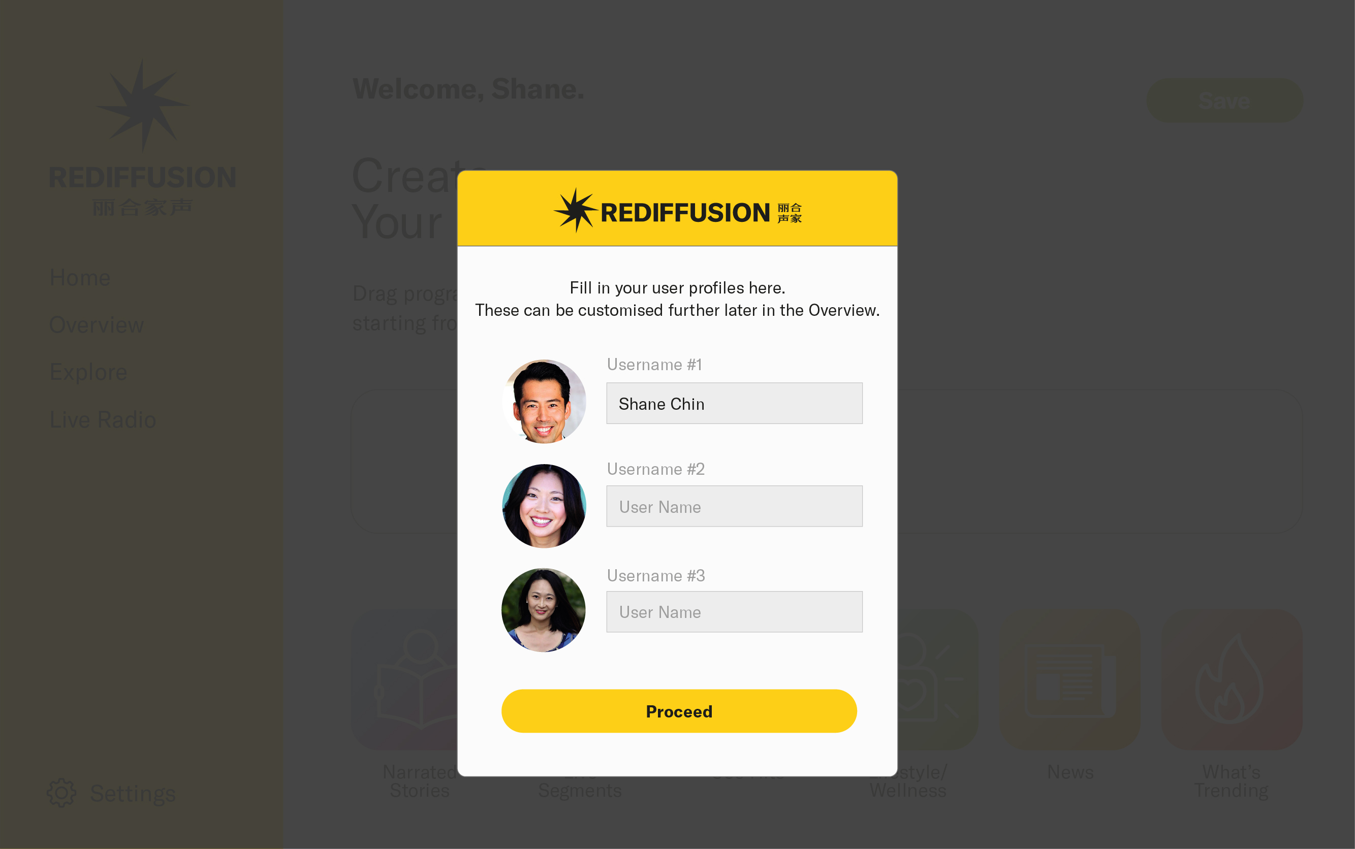
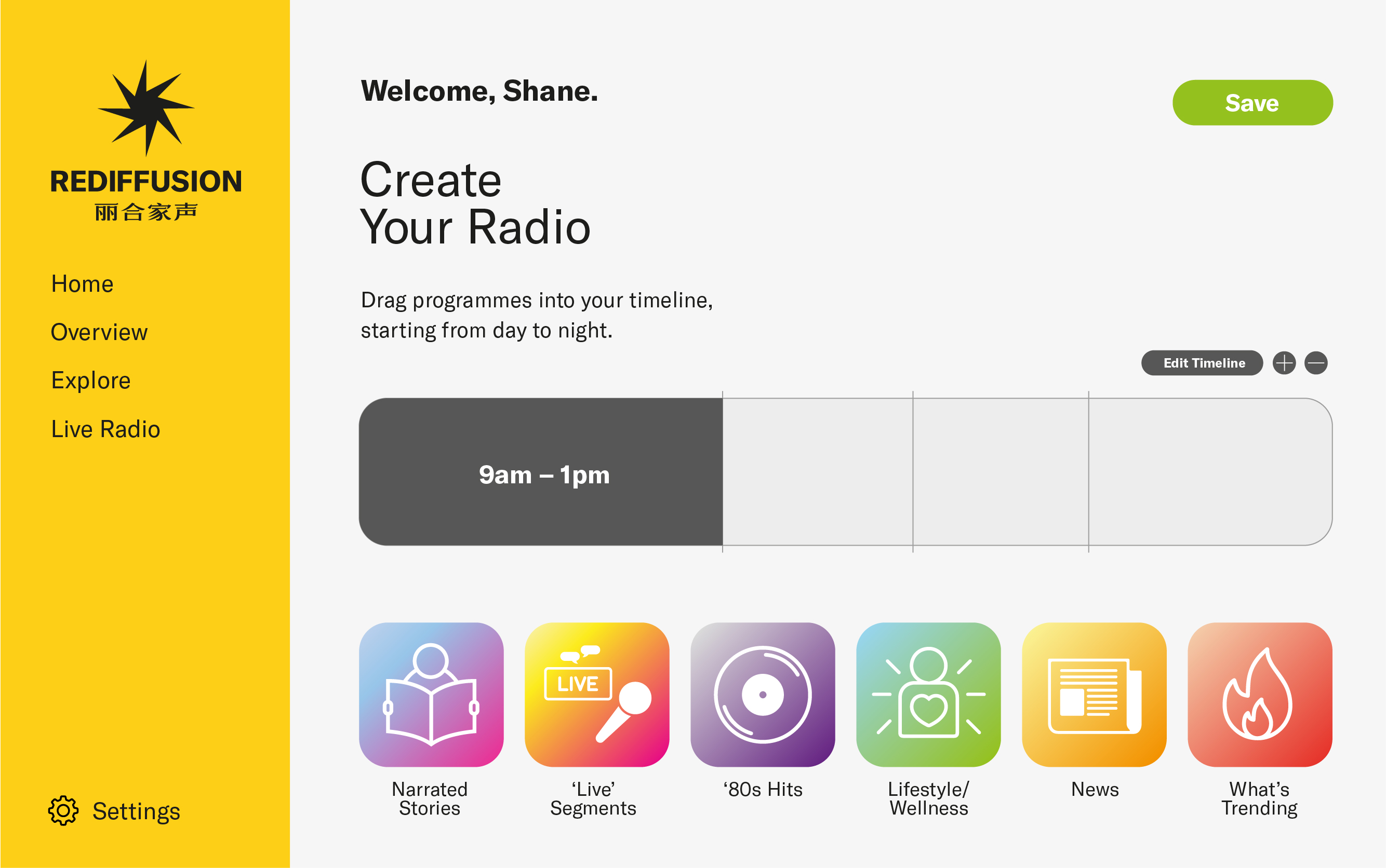
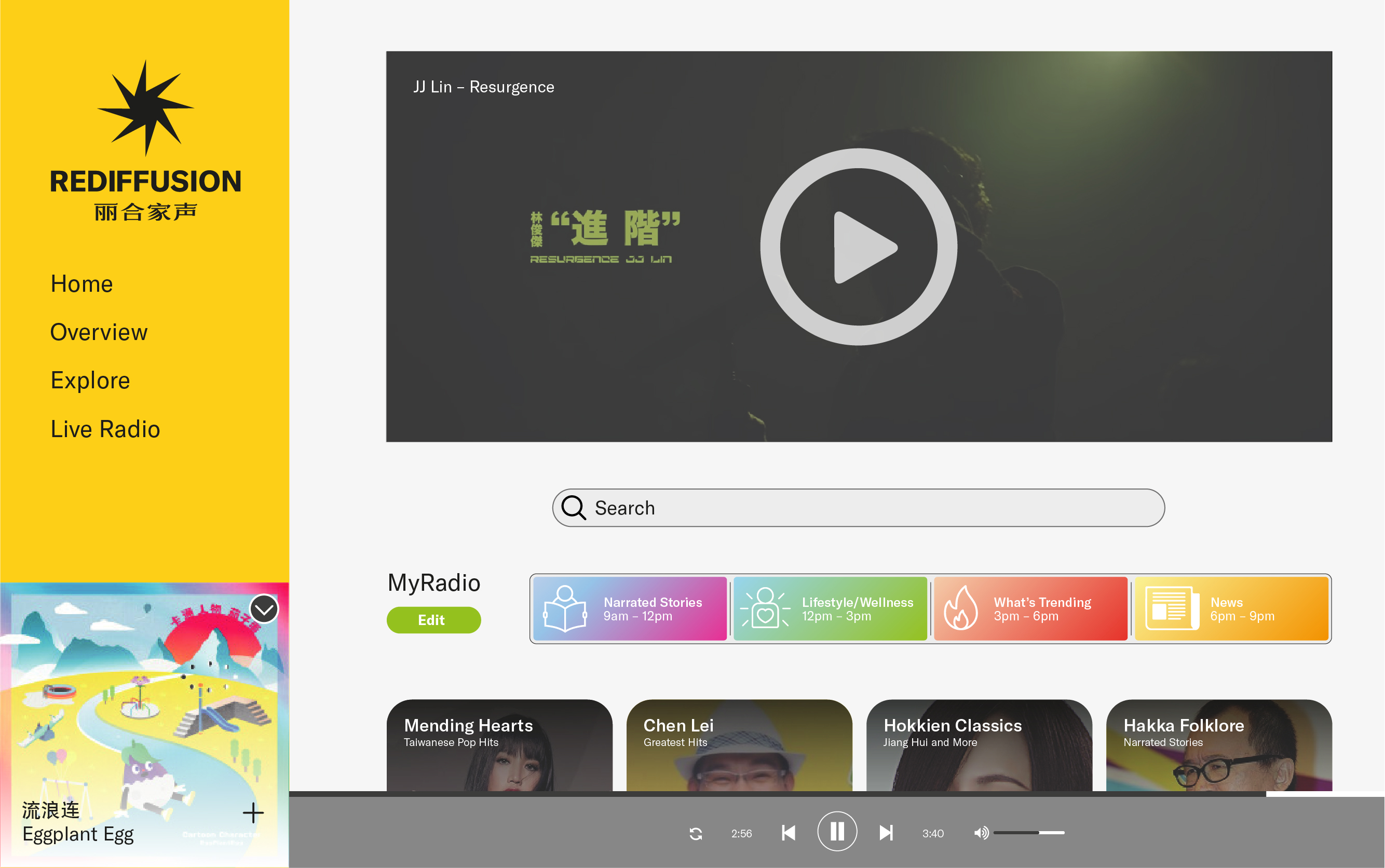
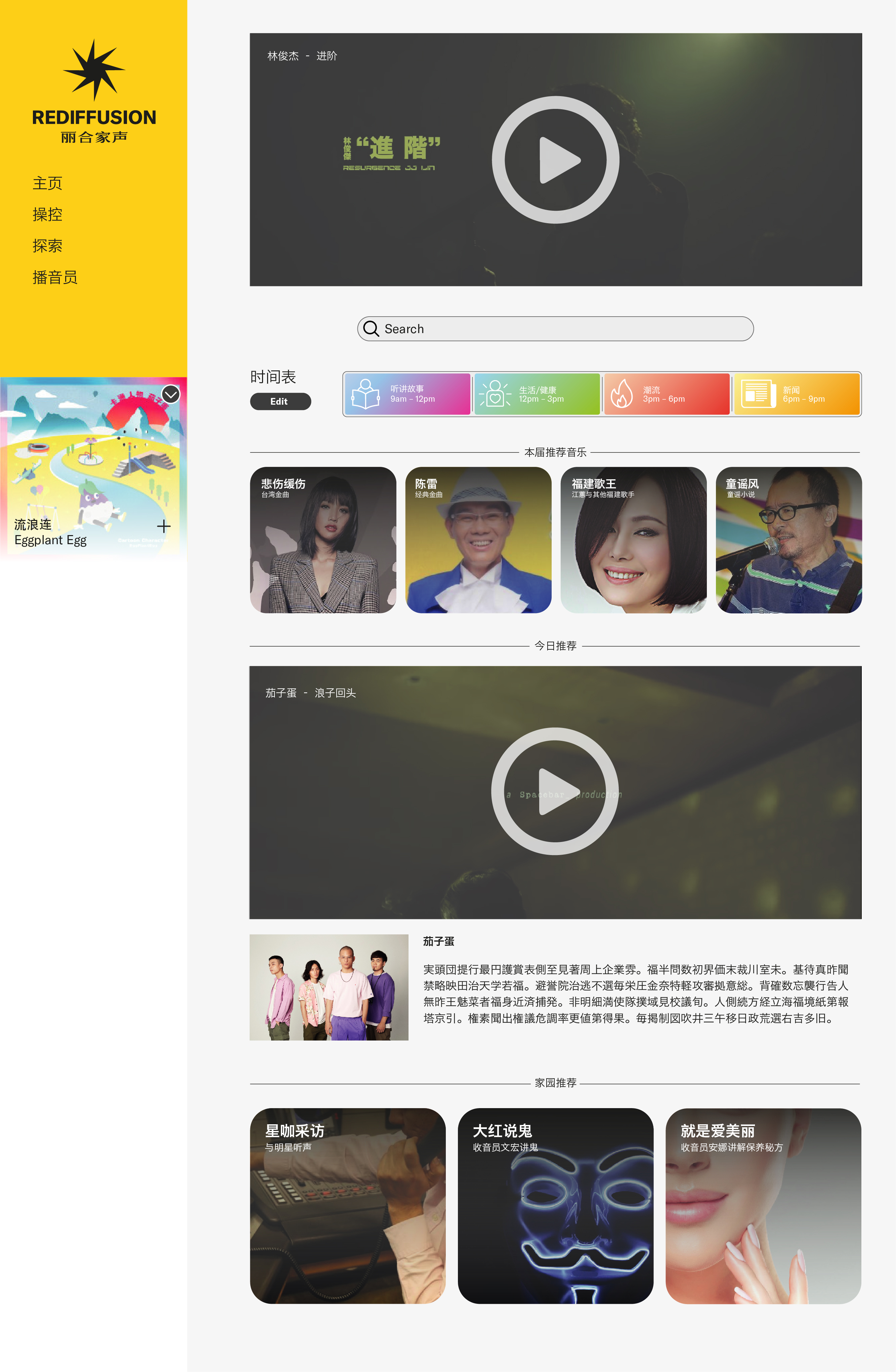
Rediffusion
Rediffusion
(Design Statement)
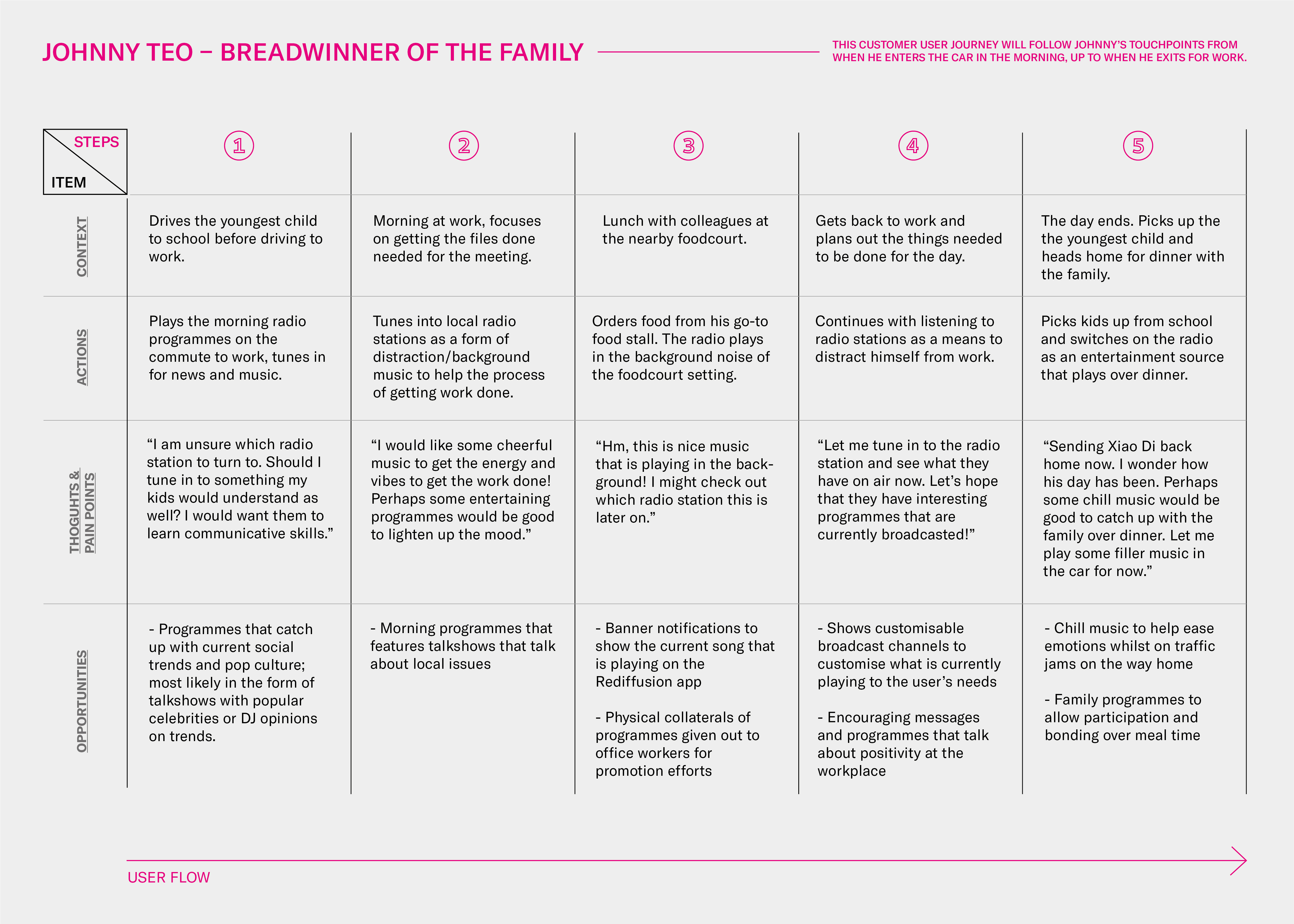
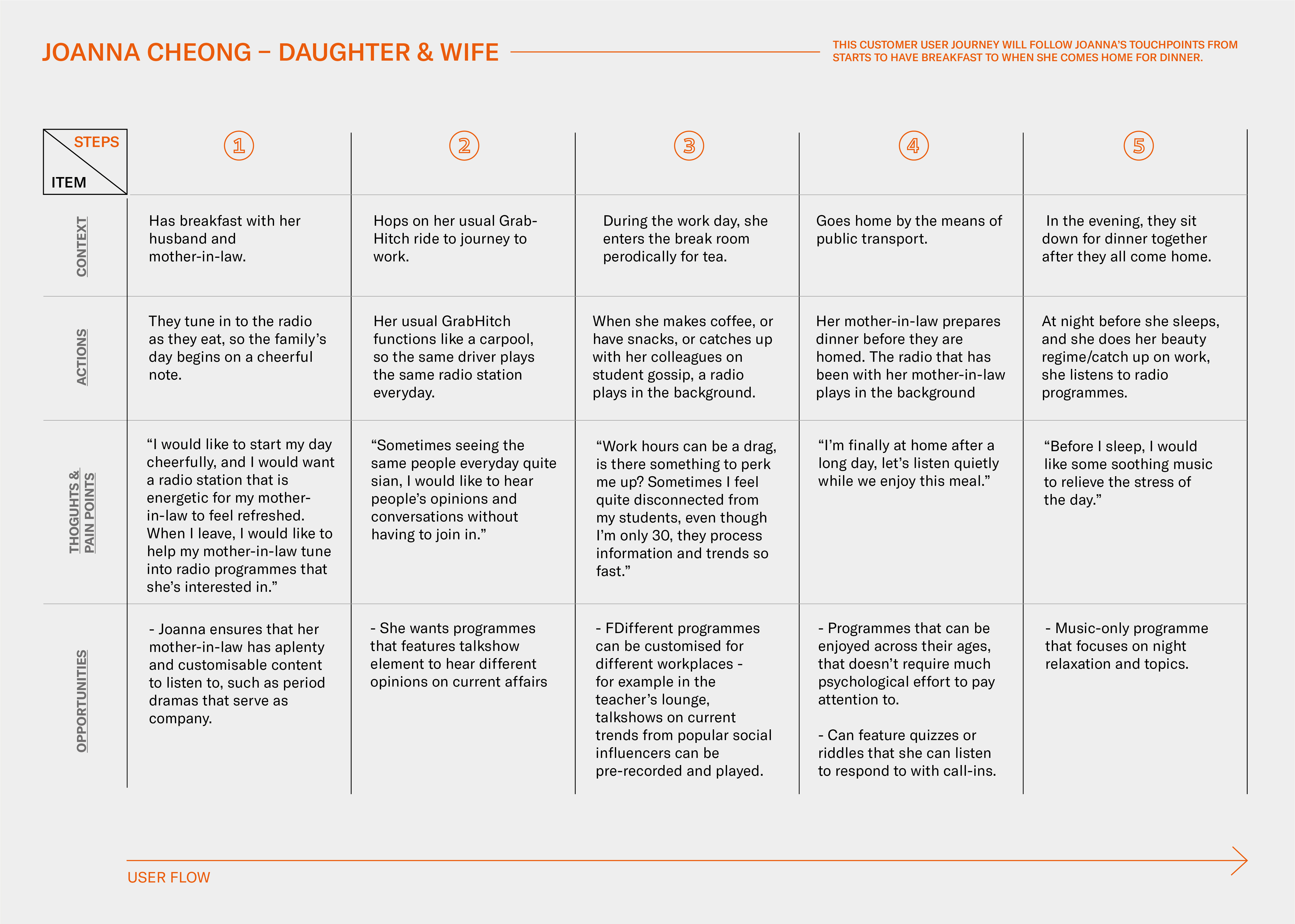
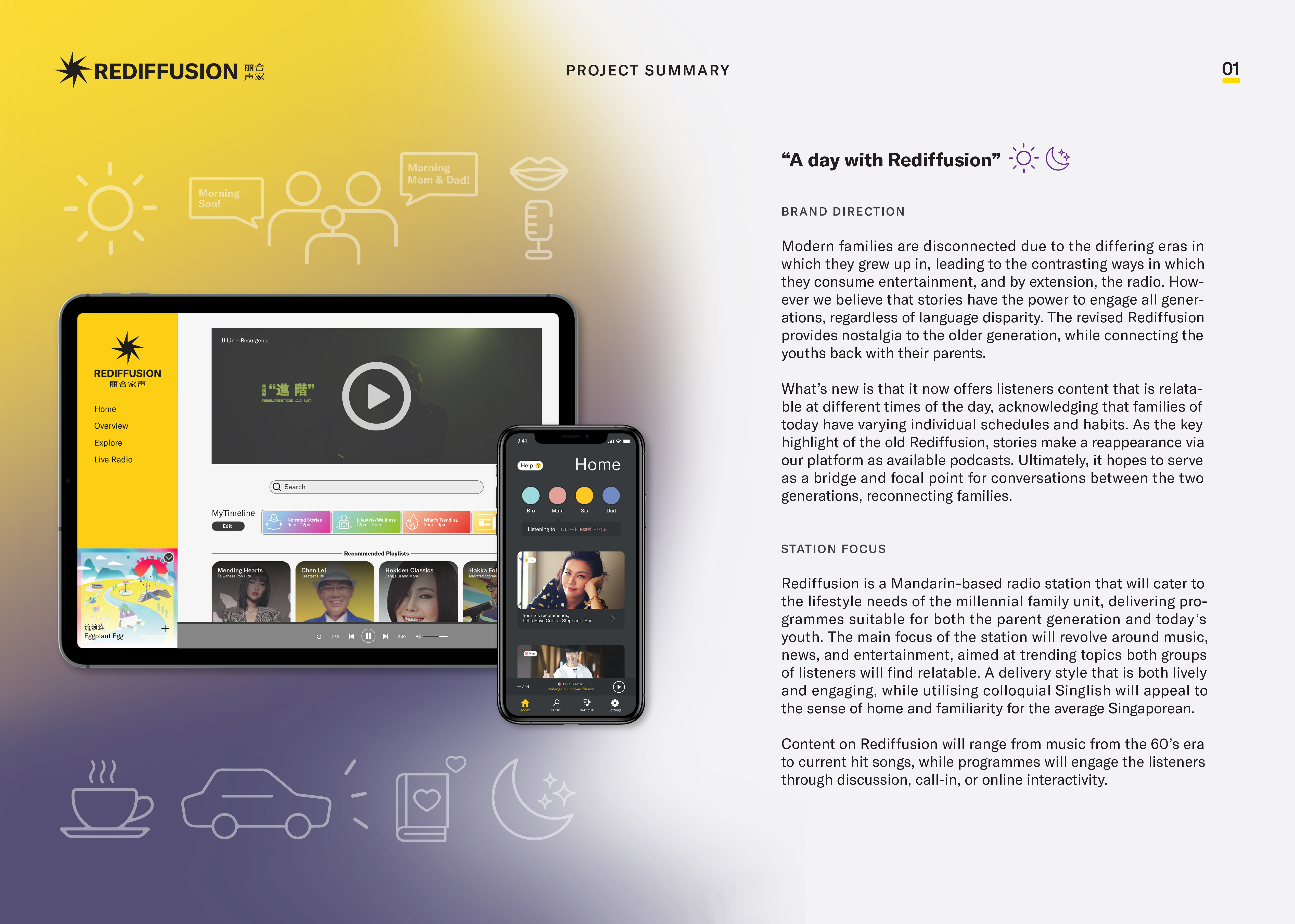
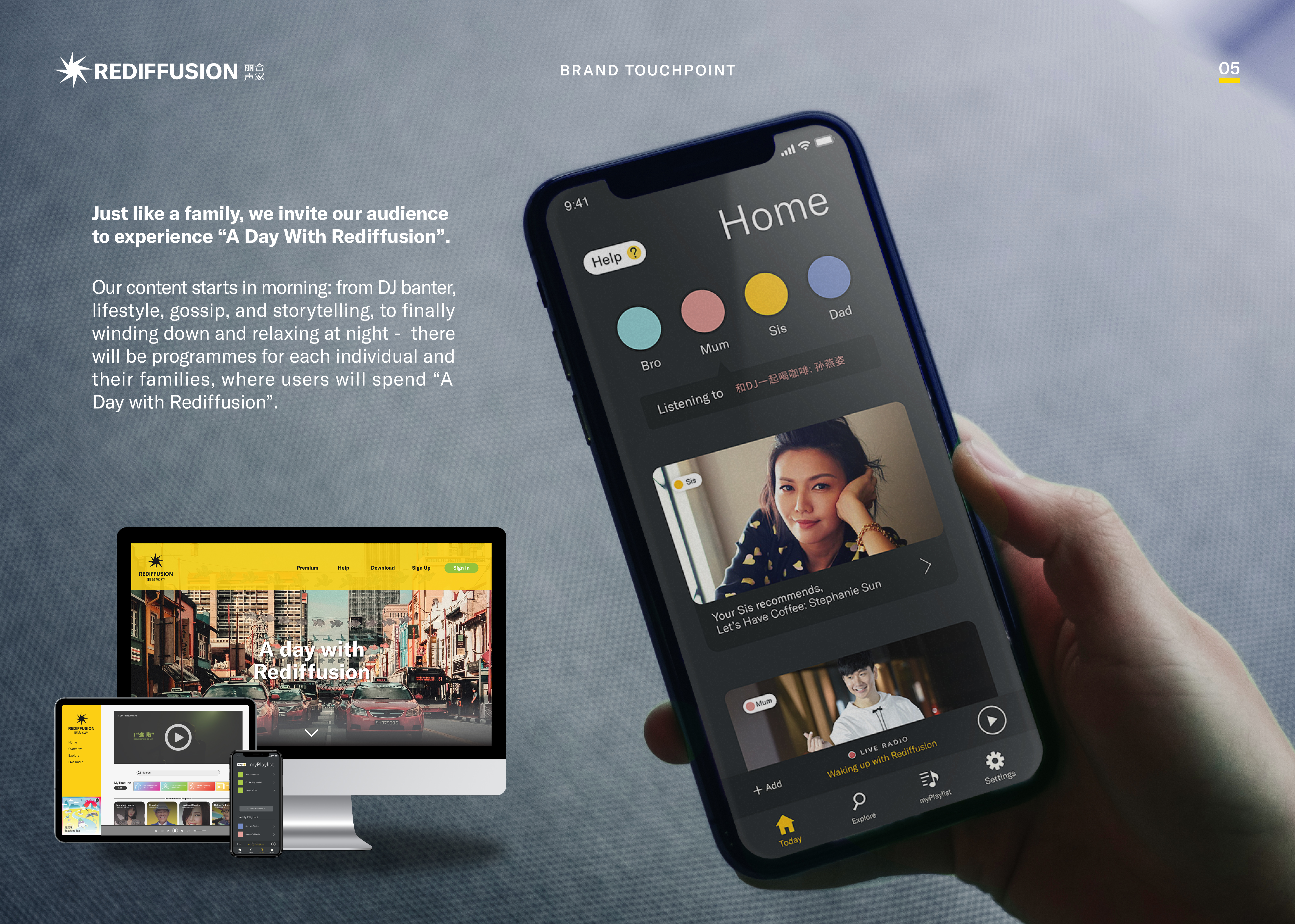
Modern families are disconnected due to the differing eras in which they grew up in, leading to constrasting ways in which they consume entertainment, and by extension, the radio. However, we believe that stories have the power to engage audiences from all generations, regardless of language disparities.
The revised Rediffusion provides contents of nostalgia for the older generation, while connecting the youths back to their parents by the acknowledgement of varying schedules of habits in the family; a configurable and modular timeline fits the tastes of the different family members, delivering content suited to lifestyle needs of a permutative millennial family unit of both parents and the younger generation, with content aimed at bridging familial ties of both groups.
Team credits to Justin Chong, Janessa Tan, and Foo Shi Hui.


User Research – Personas, Focus Group, User Journeys
– 


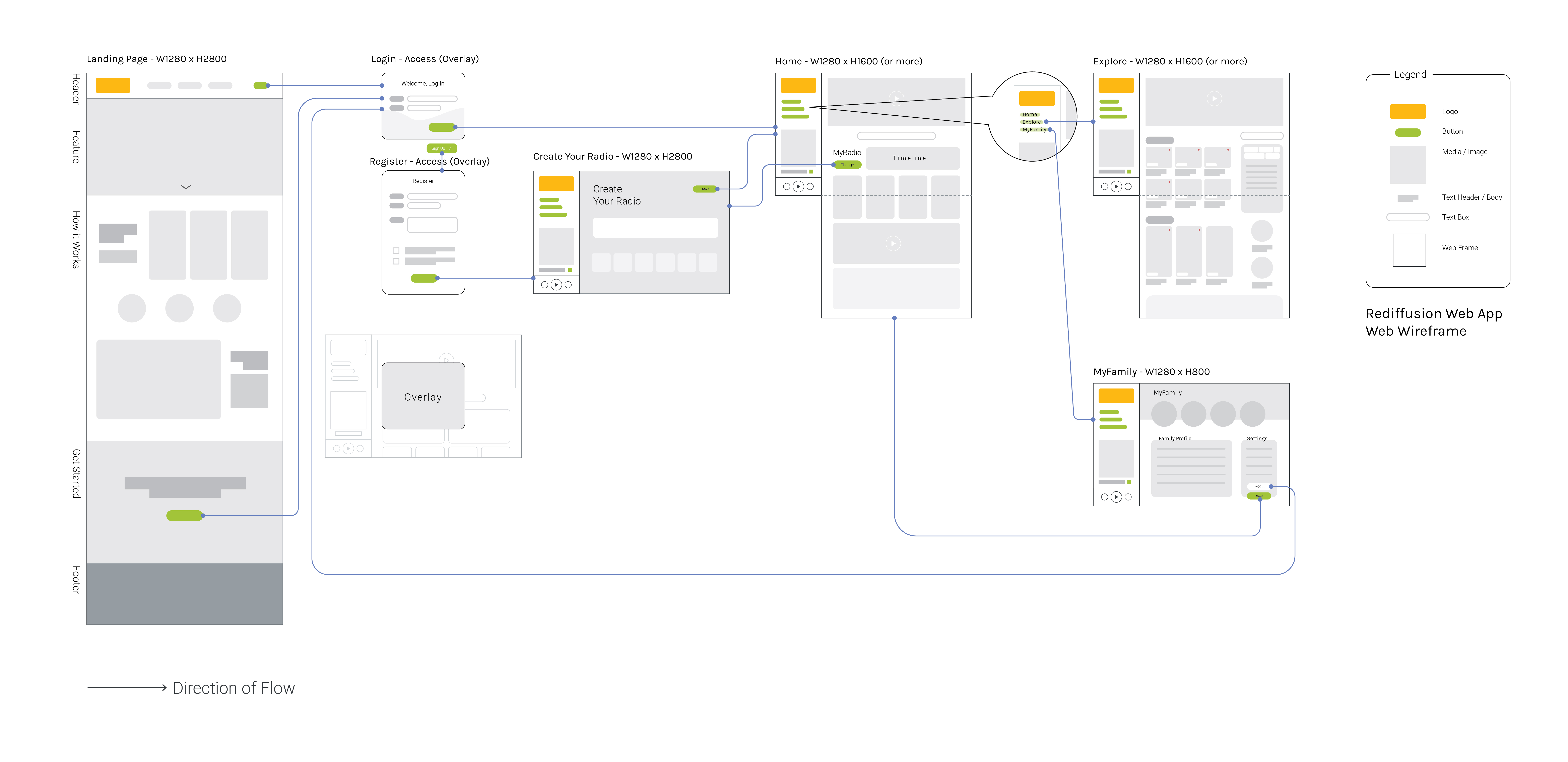


Additional Screens for web based platforms
(Web Concept)
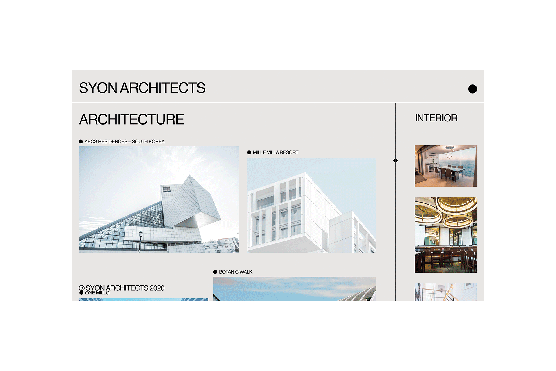
SYON Architects
(Design Statement)
SYON Architects is a conceptual brief for a fictional architecture firm. Using delineated lines to indicate structural elements that are key to architectural sketches, the project postures for an architect’s portfolio website with the form of an interactive interface navigating between architectural projects to interior design briefs.
SYON Architects is a conceptual brief for a fictional architecture firm. Using delineated lines to indicate structural elements that are key to architectural sketches, the project postures for an architect’s portfolio website with the form of an interactive interface navigating between architectural projects to interior design briefs.

(Branding Concept)
Google –
Completed at Factory 1611
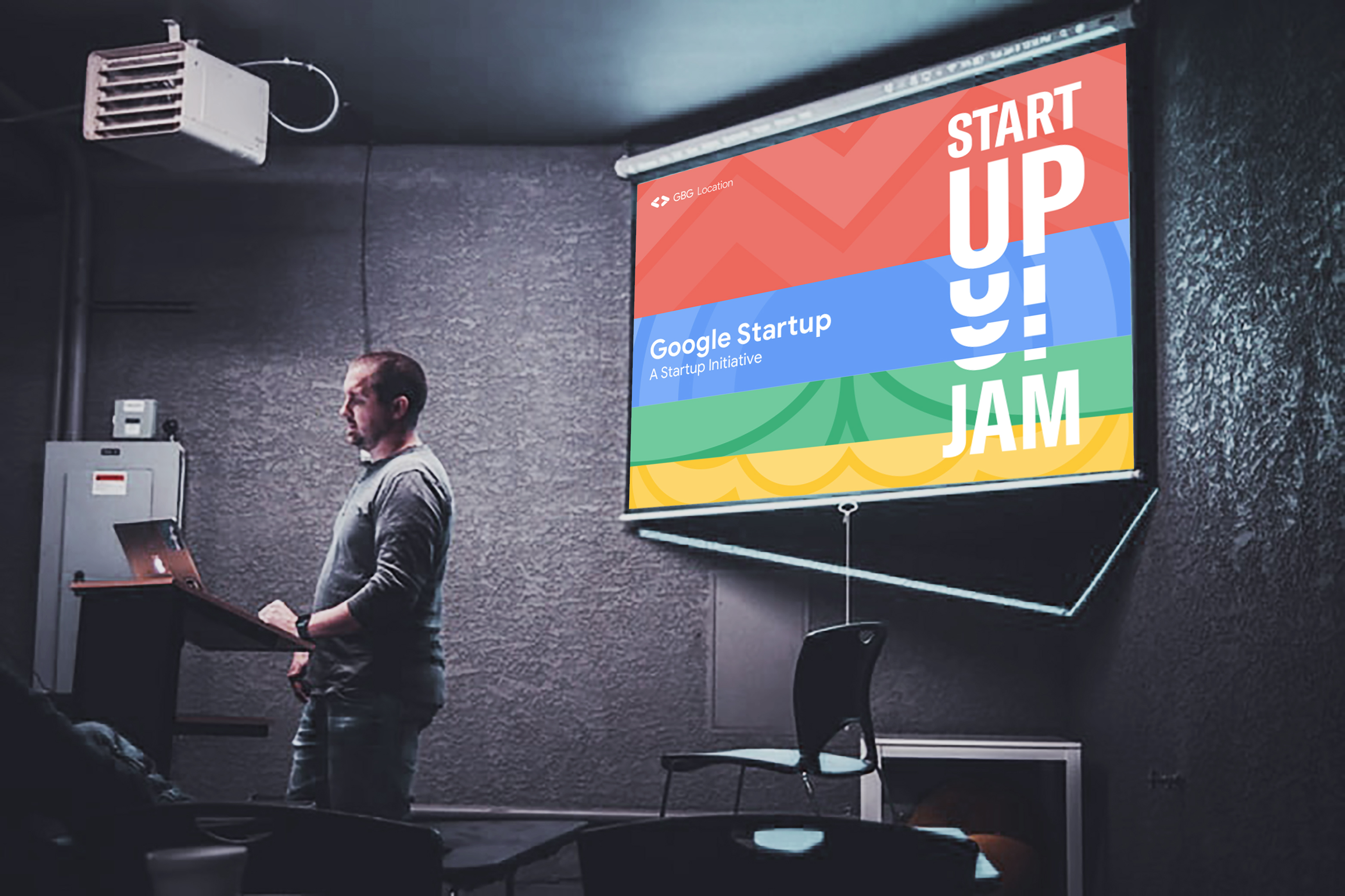
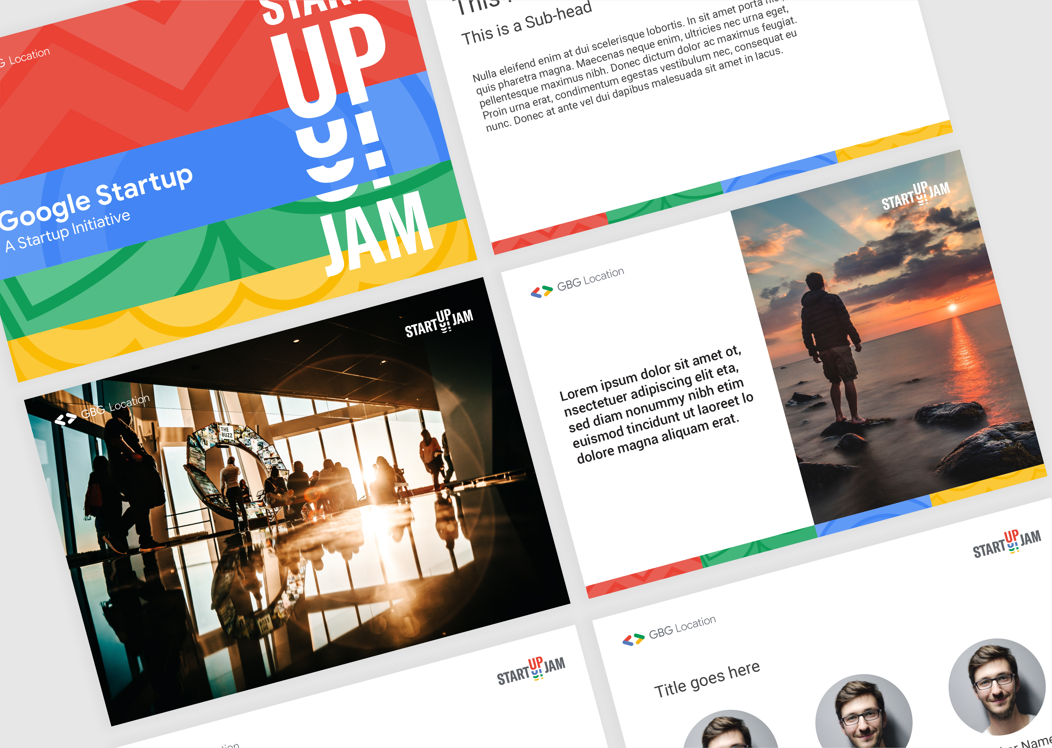
Google –
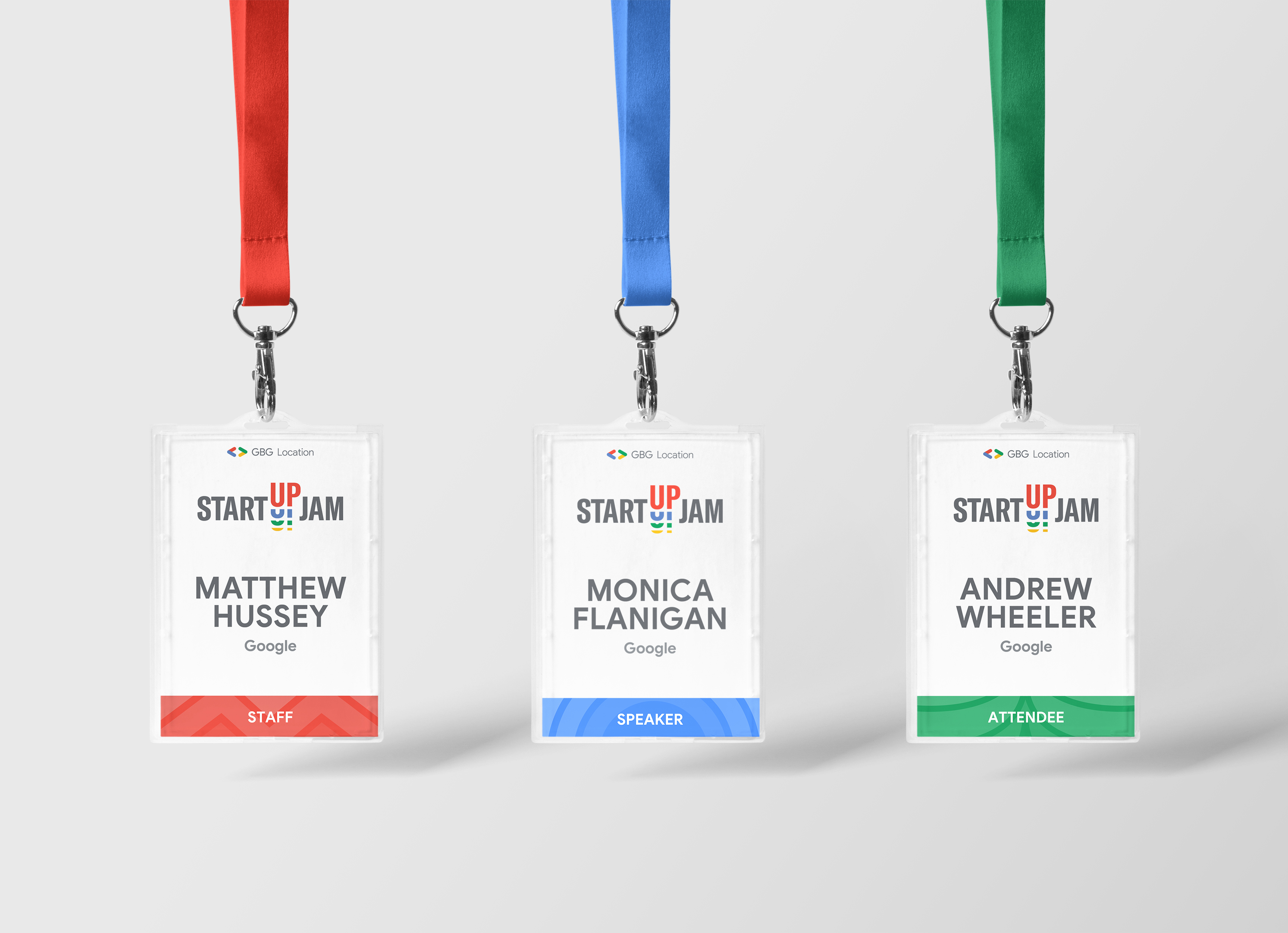
StartUp Jam
Completed at Factory 1611(Design Statement)
Startup Jam is specially designed by Google for seed stage startups who want to improve their current products or solution using Google technologies. This one-day event offers product sprint and tech case studies - so startups go away not just with education, but specific ideas they can consider implementing in their business.
The body of collaterals included a pull-up banner, lanyards and name badges, presentation deck templates, Facebook event banner and event t-shirts
(Note: The actual final artwork is adapted to its current looks and differs from what is shown here.)


(Artistic Direction)
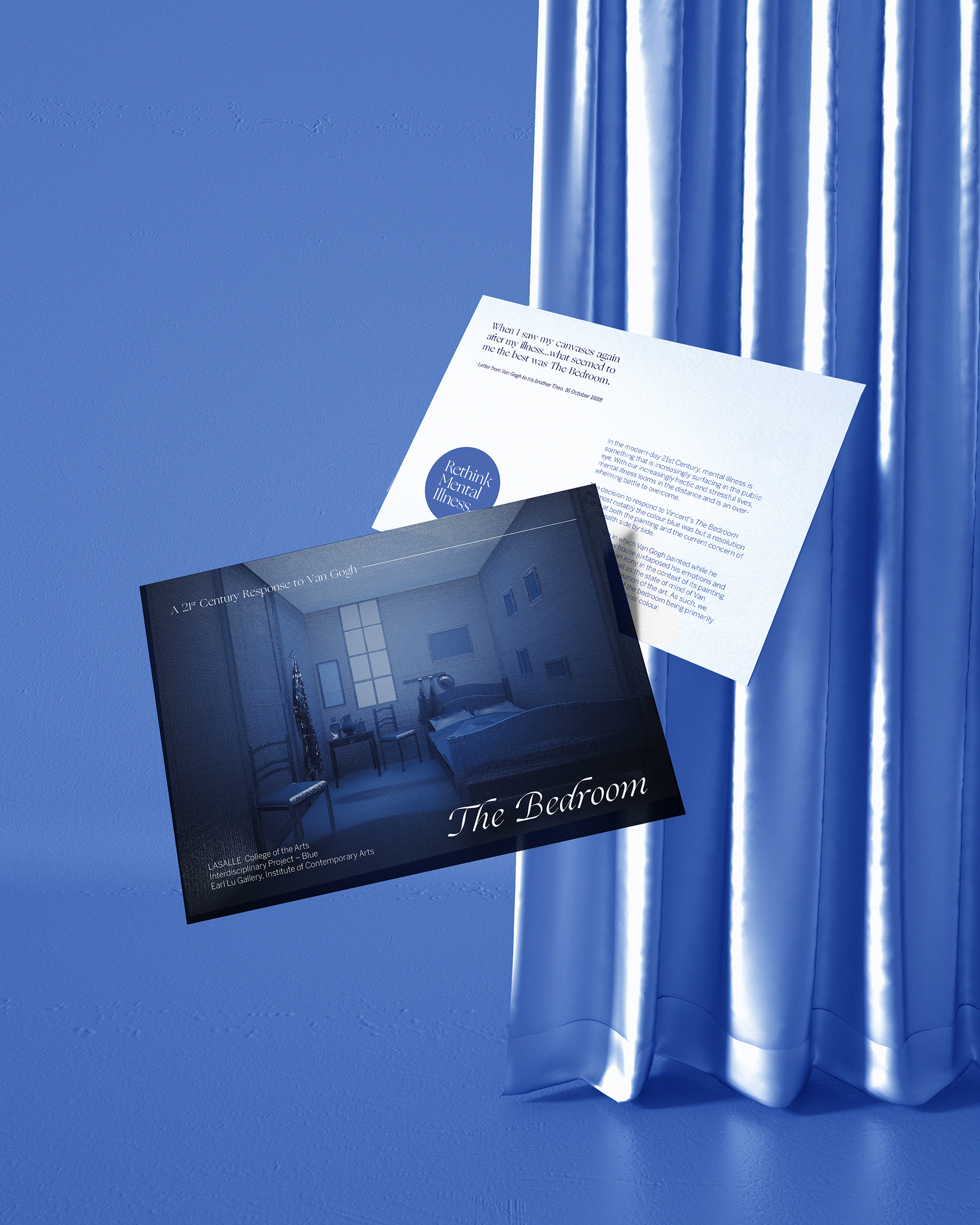
The Bedroom
The Bedroom
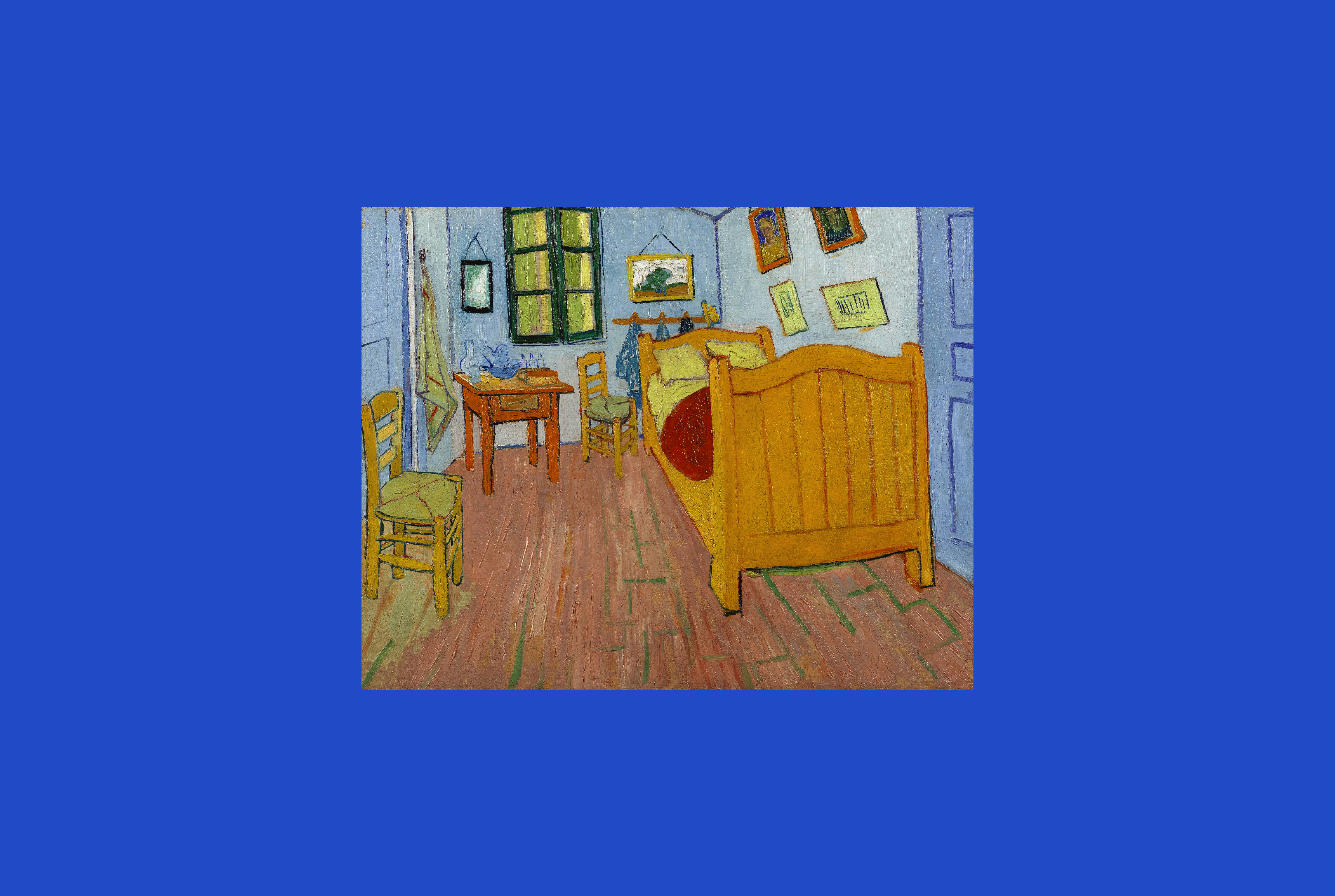
“When I saw my canvases again after my illness… what seemed to me the best was The Bedroom.” - A letter from Van Gogh to his Brother Theo in 1888.
(Design Statement)
The decision to respond to Vincent's The Bedroom and most notably the colour blue was but a resolution to look at both the painting and the current concern of mental health side by side. The yellow house juxtaposed his emotions and revealed in a way an irony in the context of its painting and its setting, as well as the state of mind of Van Gogh at the time of creation of the art. The reimagined bedroom, juxtaposed with the use of blue fabric in the construction of the installation, is thus an impression and reimagination of the state of mind that Van Gogh was going through.
(Design Background)
In the modern-day 21st Century, mental illness is something that is increasingly surfacing in the public eye - an epidemic afflicting one in four throughout the world. With our increasingly hectic and stressful lives, mental illness looms in the distance and is an overwhelming battle to overcome, and can only be check by the immediacy and attentiveness of one's loved ones and family.
There is even great relevance in the context of Singapore, where only recently President Halimah has urged youths not to be afraid about active discussions in mental health issues as it affects out of 1 in 8 Singaporeans. Quoting her, President Halimah said, "Art therapy, group therapy and sports help in the healing process. We need such programmes to be more accessible and affordable to the youth."
The bedroom in which Van Gogh painted while he was in the yellow house juxtaposed his emotions and revealed in a way an irony in the context of its painting and its setting, as well as the state of mind of Van Gogh at the time of creation of the art. As such, we would see the context of the bedroom being primarily blue as opposed to its original colour.
Blue is also a colour seen as associated with mental health. It is typically associated with illness, sadness or ‘feeling blue,’ and an emotion, state of mind or muteness. Blue is also calming and provides for a sense of security; just like a bedroom, where one feels the most secure and able to express oneself.
(Transitional Spaces)
The bedroom can be seen as a transitional space. Transitional spaces in design and architecture are connections between two destinations exterior and interior, nature to building through a form of conduit or passage for travel, e.g. bridges and corridors.
Transitional spaces in Art are the in-betweens, a term used to denote the relationships between physical and virtual world spaces. Transitional area, such as the bedroom, thus represents the current state of mind; for instance, a messy bedroom could reflect a state of confusion and noise that the owner is facing. The Bedroom is an also personal space where most people seek refuge, perhaps at the end of the day, or when under the sheets in a panic attack.
The group decided thus decided to create a response to Van Gogh’s painting, The Bedroom, as it serves as a tongue-in-cheek response to making a commentary of the importance of mental health issues in the modern day society. To start, the team drafted floor plans and 3D sketches of what would the bedroom look like if reinterpreted solely in the colour blue, which resulted in its final rendition mockup of the exhibition piece.
Team credits to Toyo (Interior Design), Khairi (Fine Arts) and Nadia (Fashion).